Carbyne
2025
A new identity system for Carbyne
A full rebuild of Carbyne's visual identity: new system, new consistency, built to carry the brand into its next chapter.
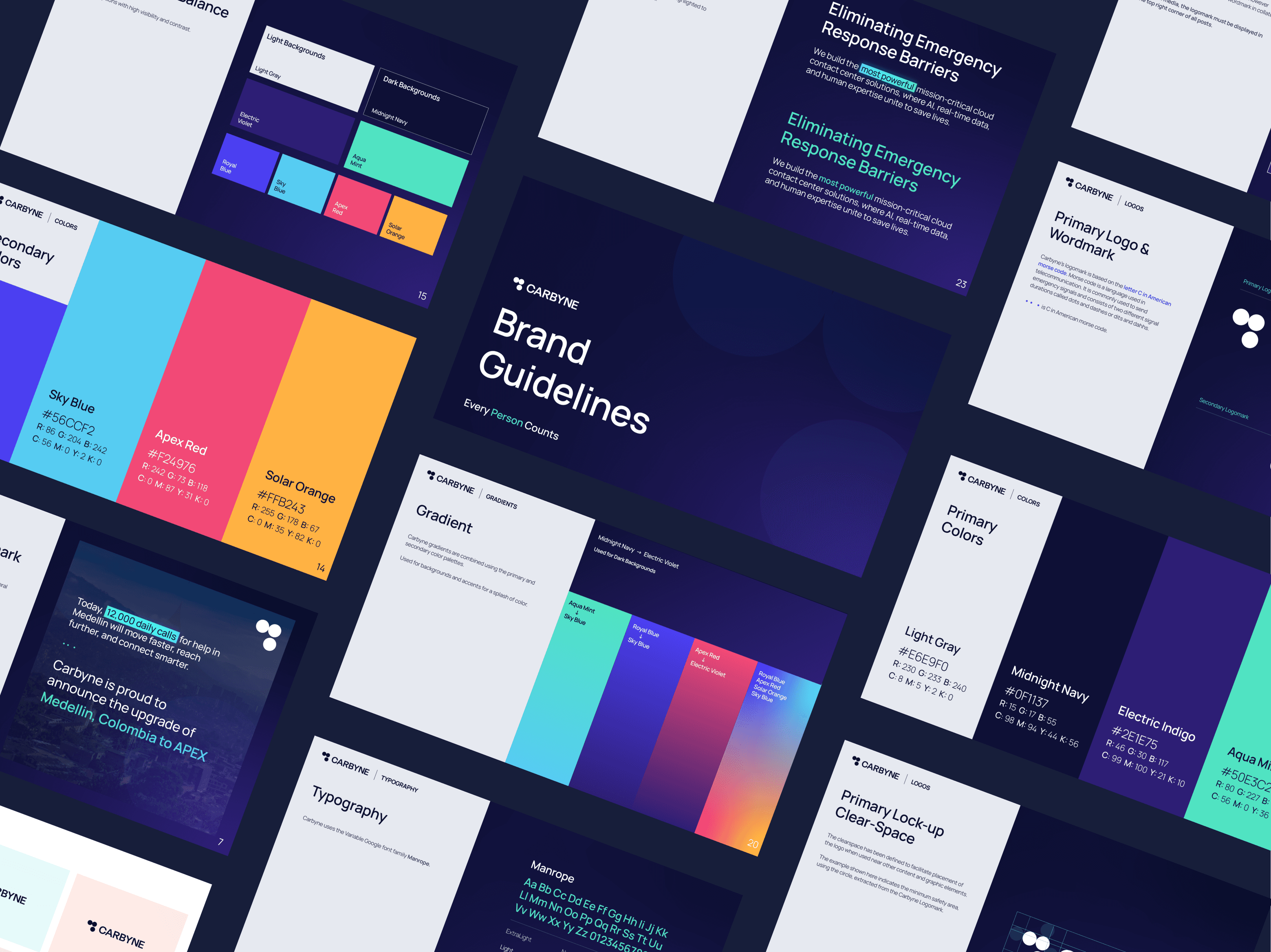
Overview
Carbyne and the Branding Issue
Carbyne is a technology company that builds modern emergency‐communication and public safety solutions. Their goal is to update and enhance how emergency services work, using real-time data, multi-media, cloud infrastructure, and AI, especially within Next-Generation 9-1-1 systems. I led a rebrand amidst their Series D fundraising efforts.
The previous brand suffered from low contrast, limited color variance, and typography that didn’t hold up under different conditions. The new direction introduced balance, clarity, and a scalable design system that elevates Carbyne’s identity while maintaining functional integrity, especially in high-stakes, mission-critical environments.
Solution
Balancing cutting edge design with a versatile palette
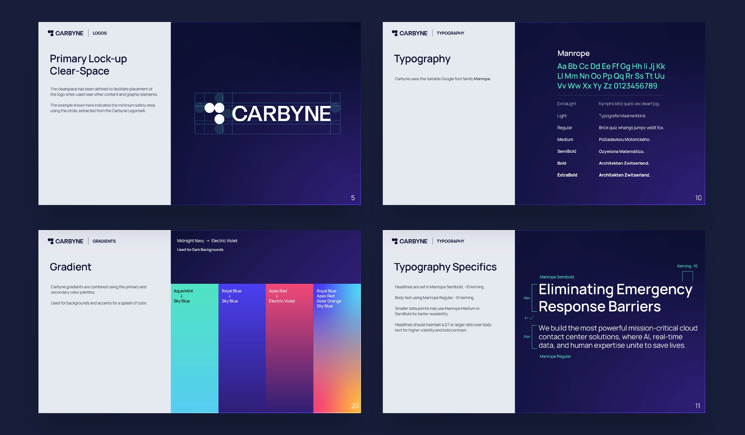
Example brand guideline pages
My goal was to bring visual harmony, accessibility, and modernity to the forefront. I developed a new, unified brand system anchored by a versatile color palette that meets both AA and AAA WCAG accessibility standards. These colors were carefully chosen to maintain readability and contrast across both light and dark modes, ensuring the brand performs just as well in a product UI as it does in a marketing asset.
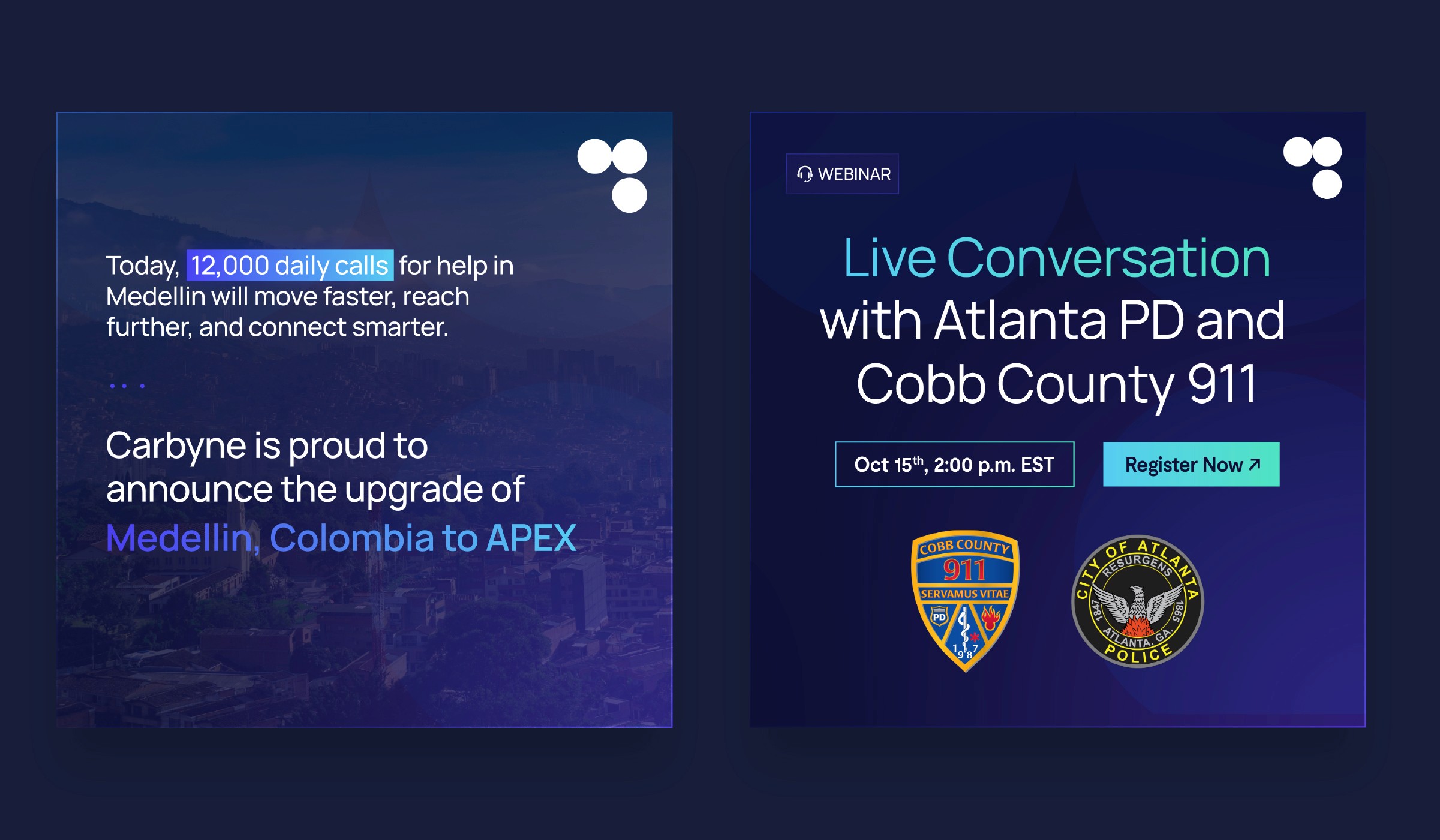
Customer and Webinar Template
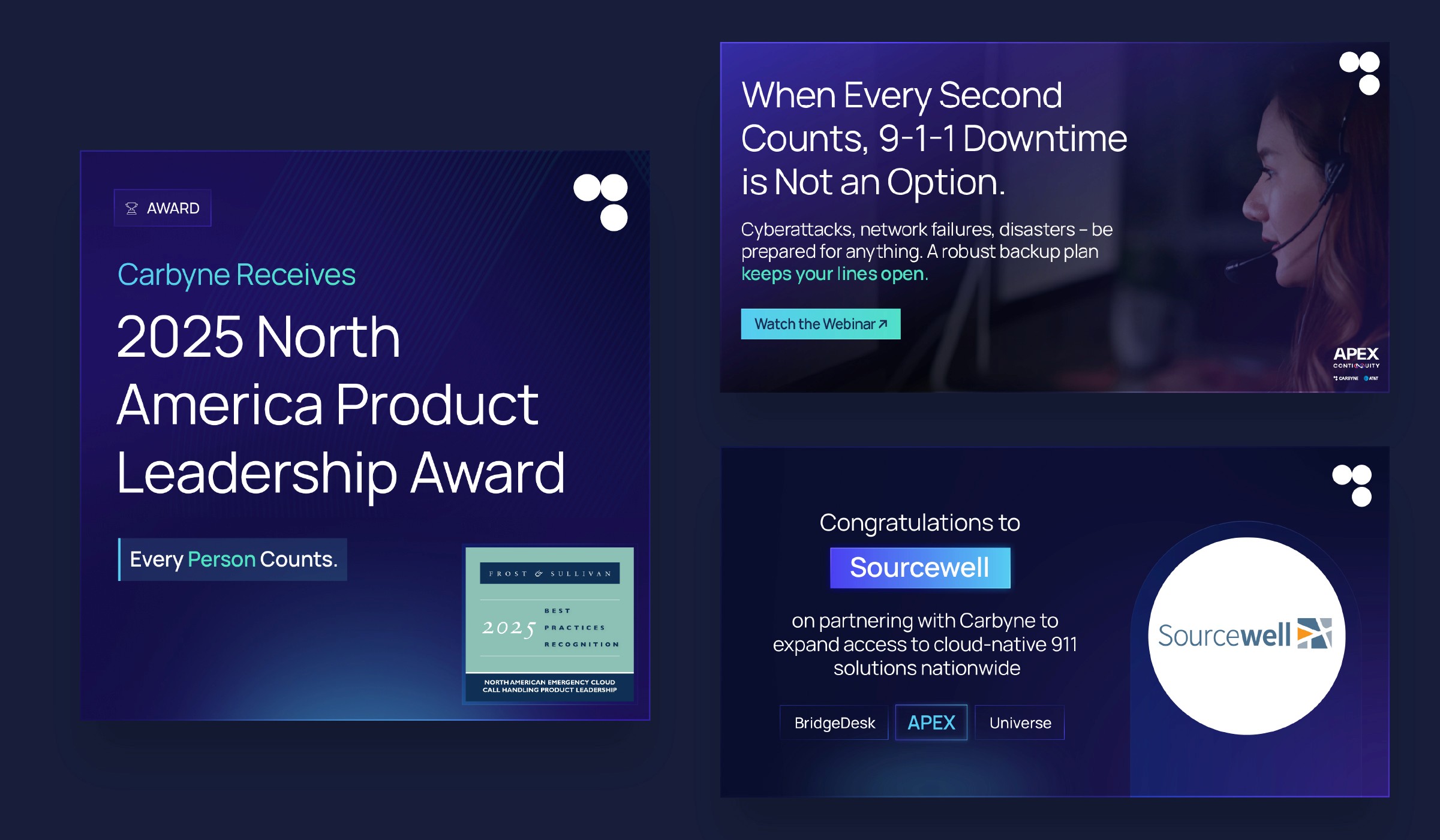
Linkedin posts
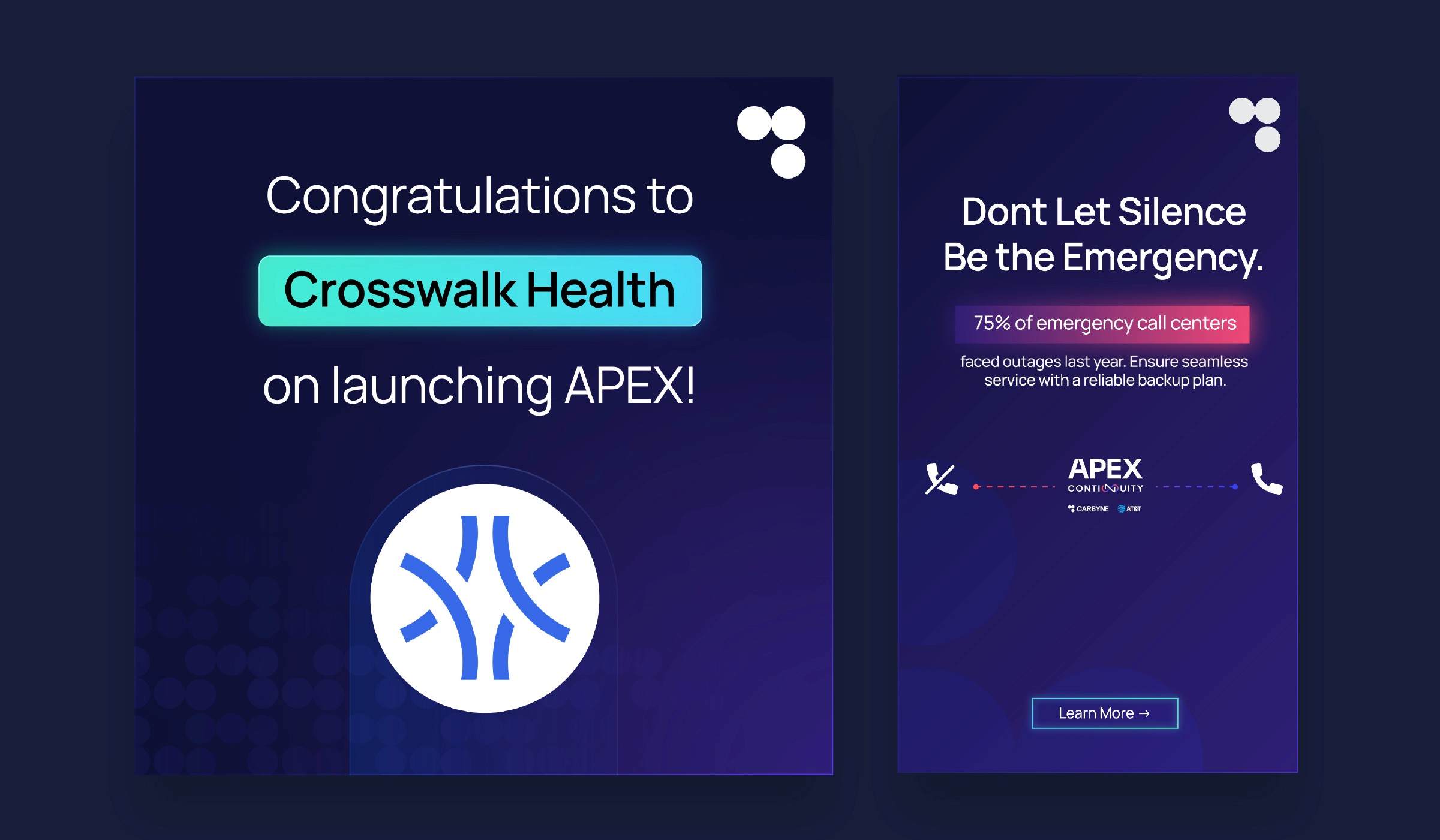
Customer template and organic ad
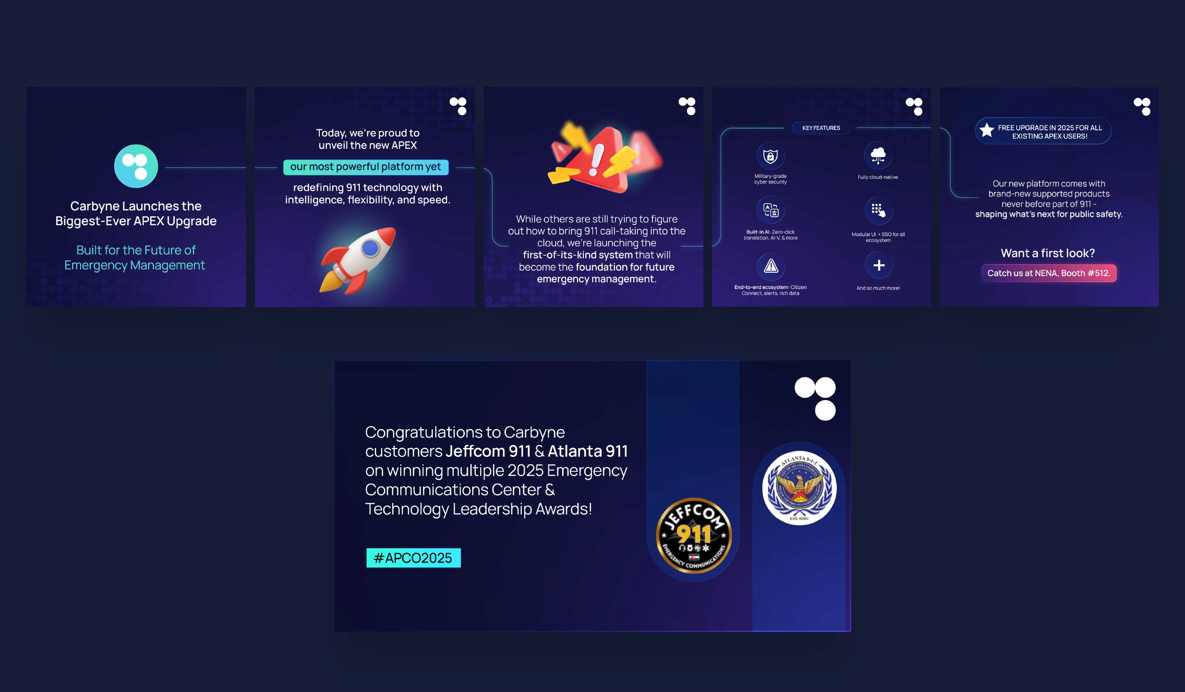
Social media carousel and Linkedin graphic

Homepage Redesign
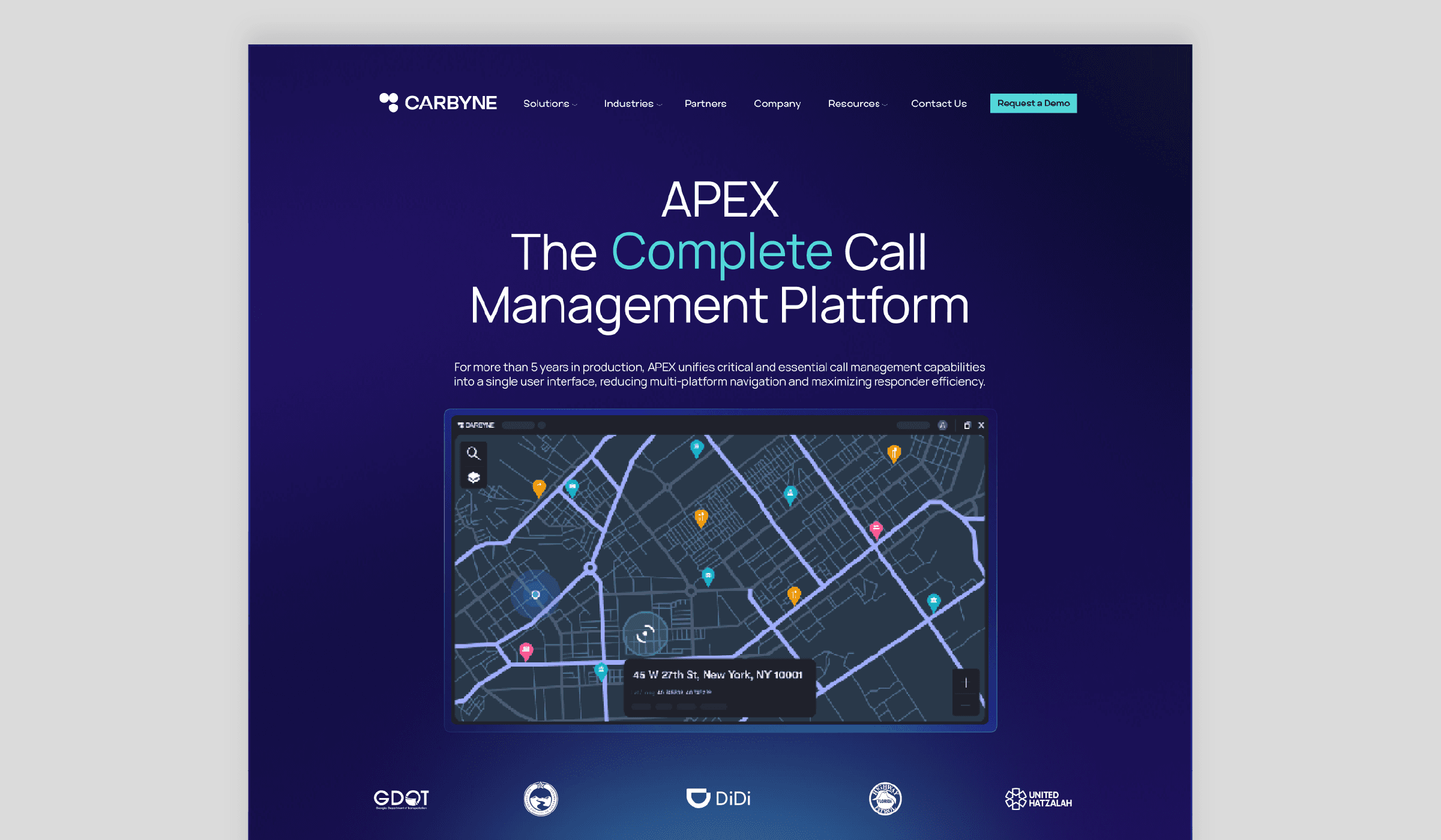
Product Page
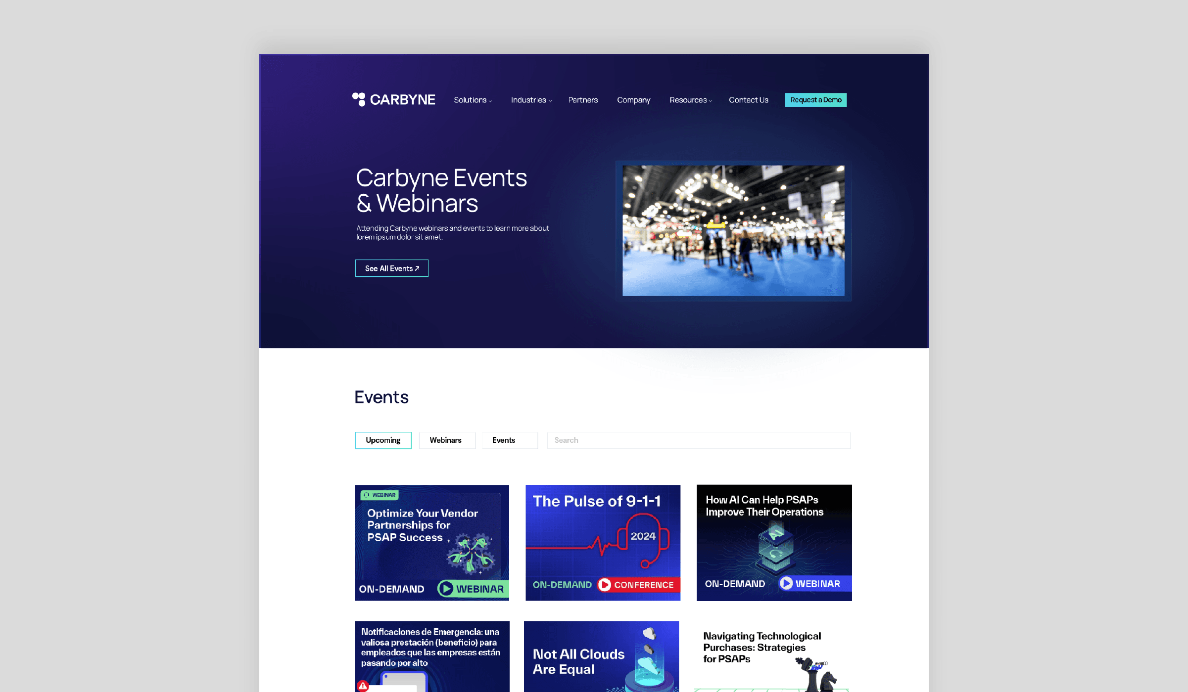
Events Page